Experimental Samurai Illustration
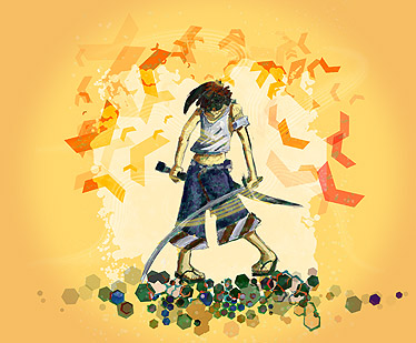
I have had an itching to do something a little more creative and unorthodox lately. I am usually very self-concious about my artistic skills and always think that the only way I can make something good is by following someone elses’ example.
For many years, I drew scrictly by copying manga and trying to duplicate other things I like. While I still enjoy that at times, it quickly becomes boring now.
At that time, I could draw fast and accurately, but I felt like I had zero creativity - just memorizing patterns, color schemes, techniques, and anatomy. They were nothing more than studies and learning resources. This is when I really started questioning why I do art - and what I am trying to accomplish with it.
This isn’t a post about my art life, but it is good to be introspective about your purpose. Knowing what type of artist you are gives you more direction and creative drive when coming up with new things. I really like playing around with techniques and coming up with “new” ideas. Just about everything has been done, so “new” is relative to what I know.
Anyway, I will explain how I created this illustration from start to finish.
Ideation and rough concepts
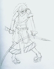
Art and design is all about the idea, everything else is just details. I love doing digital art that feels natural and free-flowing, so I start things off on a sketch pad. At first I wanted to copy an existing character, but couldn’t find a pose and character that really evoked what I wanted to convey.
I have come to the conclustion that I have vacansopapurosophobia. I can’t pronounce it and couldn’t spell it if asked, but almost all artists have it. I turned on some good music and just started doodling. I drew a couple pages of poses and picked one that was appealing to me. I drew a frontal view and started putting together what the character would look like. I wanted him to be some type of warrior.
I don’t like over-the-top or stereotypical characters. Stereotypes are rigid in nature and have much less character and personality than flawed, imperfect characters. My samurai warrior needs to be young, clumsy, and unconfident. His shoulders are up high, indicating anxiety and tension.
Inking and Painting
I scanned in a rough version of my drawing at 150dpi, where I would clean it up a little. I don’t like photo-realistic art, so I wanted to keep it loose. I took a pen and traced over it on a seperate layer. I started painting the samurai with an artistic brush in Painter X.
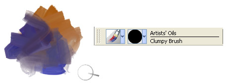
I really have fallen in love with the Artists’ Oils brush category. The brushes run out of ink during the strokes and begin mixing simultaneously with your existing paint underneath.
They really give it a more expressionistic and traditional feel. Doesn’t the brush strokes above look so natural and beautiful. I didn’t create any variant of the brush. It is all just the default settings. No blending used as well. Fantastic!
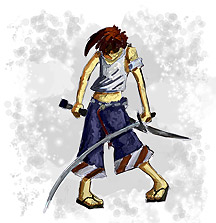
I added an aura around him using a waterbrush. By using salt and water brushes sparingly, you can create a nice looking entourage. At this point, I didn’t know if I needed to develop it any further, so I brought it into Illustrator where I continued.
Illustrator
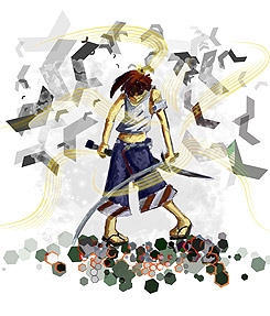
In the ImagineFX magazine I read, most concept artists seem to go back and forth between Photoshop and Painter, but I thought Illustrator has really fantastic tools to help as well. I popped the graphic in Illustrator and started playing around. There was a nice road sign symbol in the symbol libraries, so I thought I would use that.
The key to using the image sprayer is having variety. When you first lay down embellishments with the spray can, they are all uniform in nature. By rotating, resizing, staining, styling, scrunching, and tinting the graphics, they look a lot more lively and dynamic.
The ground is just a symbol spray of a hexagon. Some of the orange and colored rims of some of the hexagons were styles. The solid colors alone looked plain and out of context, so adding styles made them look more visually appealing.
After laying down some symbols and texures in Illustrator, I could see that the character was too abstract. I couldn’t really find a good way to switch over to Painter without losing layer data, so I ended up going back to my original character in Painter.
The hard edges in the Illustrator symbols clashed too much with the paint strokes. I defined the edges better of the samurai, along with leaving a slight hint of the sketch below in another layer. I thought that would help contain it a little better. When I was done in Painter, I just opened him in Illustrator and moved the layers over to the main illustrator file. Finally, I added a nice light orange background to help shoo away that scary white.
I thought the glowing swirls around him were getting too much attention in the graphic above, so the orange muted those element as well.
Photoshop
When I was pretty happy with the design in Illustrator, I brough it over to Photoshop where I added a slight vignette to accentuate the center. I made a slight shift to the hue/saturation settings. I really like putting a texture over flat graphics to help give them a little more personality, so I went to good old sxc.hu and found a nice bubbles picture. I changed the blend mode to “lighter color” by trial and error and set the opacity to 20%.
Pretty nice overall. I am excited how I can use some these techniques to build upon in the future.
Page Contents

I mostly keep this blog to help me remember things. Writing is also a great way to understand things at a deeper level. I would highly recommend it if you don't write at all.