Foundation Framework and Updated Portfolio Site

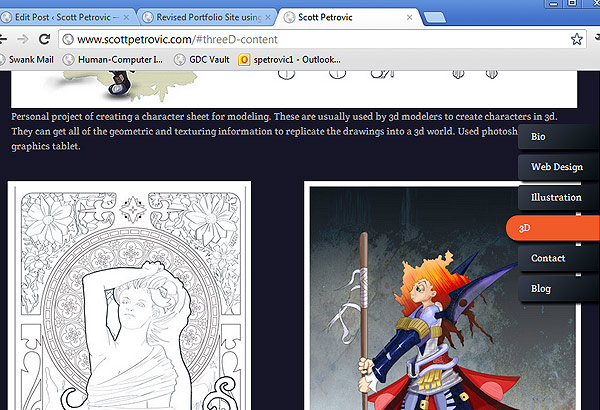
I heard about a new responsive web framework called “Foundation” a few weeks ago. I recently have been reading responsive/adaptive web design and thought I might give the framework a go. Portfolio sites are always a great place to experiment with new technologies… so here we go.
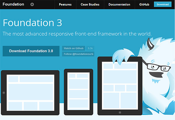
Foundation 3.0 website
One important thing to know is that it really sets up quite a bit for you. I thought it was mostly just going to be about the grid system and media queries, but it is much more helpful than that. The framework includes an amalgam of different plugins and libraries. It uses jQueryand also has responsive components like modal windows (Reveal) and slideshow viewers (Orbit). It is lightweight enough that it is easy to customize and extend. It isn’t supported in IE6, so as long as you are ok with that, it claims to have good support across the board.
It is the first time I have really done a grid-based website, but it made the responsive aspect much easier to implement without worrying about the media queries. Foundation has a lot of useful CSS classes that can show/hide elements based off the size of the screen.
Modifications and Challenges
Besides typical CSS color and position changes, I did a few other things to make it seem less “out of the box”. I created two different navigation systems that were either for large displays or small displays. I added an Easing plugin to make the transitions with the internal links. I also made some custom form validation and AJAX requests for sending emails.
Working with potentially large devices, I ran into the problem of not having high quality images for a lot of my stuff. I didn’t have access to some of the source, so I just did the best I could.
IE9 doesn’t support feature like CSS3 transitions and CSS gradients, so the experience is slightly different on IE. Less than 10% of my visitors use IE, so it isn’t a big concern of mine.
Another point is that background images don’t scale when things are getting resized. This meant I usually created background images taller than I needed. When the screen is smaller, it makes the containers taller, which affect the background images. I just created background images taller than necessary to adjust for screen resizing.

If you check out the website and look at the source code, you can see some more comments that I made.
I will definitely use this framework again for future projects. You still need to know what you are doing in web design, but Foundation is a great aid when creating website. I will definitely be recommending it to other web designers out there.
Page Contents

I mostly keep this blog to help me remember things. Writing is also a great way to understand things at a deeper level. I would highly recommend it if you don't write at all.