Responsive Web Design Book Review and Insights

I recently finished a couple of books from A List Apart titled “Mobile First” and “Responsive Web Design”. They are shorter books ( ~150 pages each), but they are concise and to the point. The mobile first was more of a sales book promoting why web designers need to consider mobile devices first and some common practices for thinking about the user expierience of a mobile user.
This post is going to focus on the responsive web design book, since it was more of a hands on book.
With responsive web design, the main technical components that make it “responsive” are percentage based width for the layout, fluid images, and CSS media queries. They are different aspects, but need to work together to make a design fully responsive. This post will be going over the three main technical components to make the design responsive.
Another term that I have heard in the design community is “fluid” designs. Fluid design doesn’t use media queries and flexible images with the tutorials I have read on them, so responsive web design is more of an upgrade to a fluid design.
The best part of the techniques in responsive web design is that you can use them NOW. Browser support is great across the board, so there is no reason to wait for better compatibility. If there is any spotty support, you can use polyfill tools like Modernizr to cover the browsers in question. After reading the book, my paradigm has shifted toward how web pages should built and designed.
This post is a bullet point overview of the Responsive Web Design book. As with most books out there, there is always a lot of “fluff” that isn’t really that great when you read. It makes the page count go up which people use as a value indicator, but in truth doesn’t add much value. I will try to keep to the points that have more direct application in doing designs.
Percentage based layouts
User agents are obsolete in web design. There are so many new devices coming out that they all have different screen sizes. It is an inefficient model to develop for specific devices. Creating designs that look good and respond at every resolution is the best design solution you can have.
Everything you know about web design still holds true, but using percentages for sizing the width of elements make it fluid. Text automatically wraps in percentage-based layouts, so you don’t have to do anything fancy with text to make the designs work when a browser is resized.
The only dimension that we have to worry about in doing responsive web design is the width. You can modify the height if you like, but people are comfortable with scrolling vertically, so leaving height properties alone with CSS can be perfectly acceptable.
Doing this approach alone can get you pretty far, but you will quickly realize that other media elements like images don’t scale appropriately. Also, the overall design doesn’t hold up when scrunched down to a smaller width. Some items might need to be rearranged to look acceptable.
Use all of ’ems'
Another important concept in making designs responsive is that the font size needs to be set in ems. Nothing is wrong with pixels, but the font will look bigger or smaller when shown on different devices that have a higher or lower pixel density.
Here is a quick wikipedia post that outlines different devices and their pixel densities. Scanning down the list just for a moment, you can see that pixel density changes dramatically based off of the device. They can range from 21PPI to well ove 300.
Your 14px font size will look huge on a 480p television (21PPI), but unreadabably small on a HTC Rezound (342PPI). The best way to compensate for this dynamic range is to use the em sizing. For reference, 1.0 em will look like 16px font on most desktop computer monitors ( ~100PPI).
Ems are a relative font size that scales proportionally, much like percentages. The biggest thing to understand about using ems extensively in a design is that they are relative to the parent container.
For example, if you have a container element that uses 1.2 em for the text size, the child element text will also expand in size – even if you specifically set the child size to 1.0 em. You have to counteract this by specifiying a smaller size for the child element.
That would make the child font-size propert close to 0.8em . In the Responsive Web Design book, the author uses a formula, but I think that is too complicated for practical purposes. I use my eyes and make sure it looks right. Dynamically adjusting the font size in a tool like firebug should give you good enough results for most applications.
Flex Those Images
Just as you can set the width of any block level element as a percentage, you can also set the width of image tags in the same manner. A good CSS rule in responsive design is to create a style that makes all images have a 100% width property. This will allow the image to scale based off of its container – just like the containers scale with percentages. Setting the max-width to 100% will stop any pixelation of the image getting stretched.
This brings us to a point about images and how they should be exported. Using this technique, it is perfectly acceptable to output images larger than you would usually use. The performance hit should be pretty minimal in most situations. In this day and age with streaming video and audio, adding 30-40KB of information to the images won’t have too big of an impact on performance.
The first time you see fluid images in the wild makes you jump up and down with excitement. The way the images interact with your browser window makes it feel like a video game. Ok – maybe not that exciting, but it is still pretty cool to see if you aren’t use to it.
There are other customized ways you can display images using the min-height and clipping CSS properties to scale the images differently.
Media Queries
With doing percentage based layouts along with some min-width attributes, you can get pretty close to what you need. There might be some instances where you need to really alter the CSS stylesheet that won’t work at other dimensions. These are called “breakpoints”.
The best way to implement breakpoints are to use media queries.
[show a couple code examples of media query implentations]
Media queries have the intelligence of looking at your web browser window and logically determining if it should apply style sheets. You can do some hocus pocus work with javascript to determine this, but media queries are much cleaner and easier to read.
If the media query meets the criteria( width is less than 450px ), the query will apply the CSS styles. Otherwise the query will ignore the styles that are followed. The width property you set in the media query are where the breakpoint will change the design. The best way to test it out is to add in a few values in a separate CSS file and test it out in your favorite browser.
Pretty cool!!
It is an additive process when the criteria is met, so you don’t have to worry about copying the other style sheet over. You just have to create new styles for the selectors you want to update. You can add as many media queries as you would like. For maintainability sake, I probably wouldn’t add more than two breakpoints in the design. If there is any way you can use floats or other means to make it work without breakpoints, it will be much easier in larger sites.
Testing in a browser
Every browser out there has some type of analysis tool when you are testing and doing your CSS changes. I always stick with Firebug and Firefox since I think it is the most seamless and easy to use. Analysis tools will automatically update the results whenever the media queries run, so there isn’t anything special you need when fine-tuning your CSS with custom properties.
If you are testing on a web browser, an important thing to note is that different web browsers have different minimum width that that they can work work. If something isn’t behaving like you think, just remember that it might be the web browser and not your CSS.
I did a little test trying to see how small web browsers would go. The CSS rules are the same on all of the designs, but the minimum browser width is different with every browser. If you would try to make the browser window smaller with firefox, the window would get smaller, but the CSS wouldn’t respond. Chrome appears to have the smallest width that you can work with (as of version 18).
Firefox 11 - 323 pixels
Internet Explorer 9 - 218 pixels
Chrome 18 - 135 pixels

I doubt many mobile devices have a width of 135 pixels, but is something to keep in the back of your mind. I was banging my head against a wall for a little bit with Firefox’s inability to make the CSS respond to a smaller size. I started to revise my portfolio site to make it more responsive. I am still playing with the technical and structural elements, so it should be looking pretty good once I can focus on the creative aspects of it.
Here are a couple great examples that I like. I will definitely be studying them and thinking of new ways to design websites with this new enhancement. You can do a google search and find many examples that large and small companies have already deployed.
Fore Fathers Group
This website has a great creative use of colors and does an excellent job of looking good at every dimension. There is no size that drastically changes the layout. It slowly morphs the layout as the browser gets smaller.

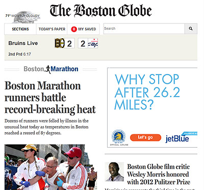
The Boston Globe
Creative websites are good, but what about websites that just have a ton of content like the Boston Globe. Instead of eliminating content, they go the approach of just wrapping the column content into less columns. It works well. You have to scroll a lot to see everything as one column, but all of the content is still presented well and browsing is still enjoyable.

Conclusion
Responsive web design is here and it is only going to be more integrated into the design process as the months go by. Taking a few moments to learn the tricks of making a web design responsive is something every web designer needs to know. Creating websites with specific devices in mind is an outdated model.
I believe framework are great starting point to get designs up and running quickly, but they lack the granularity needed to make a web experience unique and not just like another cookie cutter design. Making a design responsive isn’t a huge task if you understand the basic principles.
Responsive web design is more than just learning a few principles. It is a mindset and paradigm shift that designs are 100% dynamic. Fixed widths should only be used for the smallest and largest dimensions allowed.
Do people not use your website on mobile devices because the “acceptance” isn’t high enough – or is it because the experience is so bad that people would rather not even visit it.
Page Contents

I mostly keep this blog to help me remember things. Writing is also a great way to understand things at a deeper level. I would highly recommend it if you don't write at all.